GEView (Gene
Expression View) Tool
Download
and Installation: http://www.weizmann.ac.il/complex/compphys/software/geview/
Note on Linux
version: The result Excel file can be opened by OpenOffice
with similar functionality like on Windows.
General
Description:
- GEView is a
simple tool for visualization of expression data. It serves all available
platforms, given that expression values for each gene/microRNA/protein are
provided in a tab-delimited file as input, after pre-processing and
normalization. The purpose of this tool is to enable the Bio-Med
researchers with no computer-science skills, to intuitively visualize
high-throughput data produced in their wet experiments, in a convenient
and simple manner. It performs basic quality control steps such as
Principal Component Analysis to evaluate the experiment results and
batch effect correction. On top of all, it uses ANOVA to
identify genes which are differentially expressed between the various
experimental conditions. It provides immediate visualization of all genes'
differential expression in the various experimental conditions together
with ANOVA p-values, through a click on the gene in the output Excel
file. In order to complete data visualization, links are also
provided for GeneCards, UCSC and
NCBI genome browser databases, for each specific gene.
This tool was developed
by: Libi Hertzberg, Assif Yitzhaky
(Domany group, Weizmann Institute of Science) and Metsada Pasmanik-Chor (Head
of Bioinformatics Unit, Faculty of Life Science, TAU).
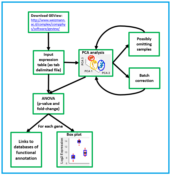
The following flow
chart summarizes the functionalities of GEView.
Input:
Microarray
format:
A text
tab-delimited file with normalized and summarized expression values (log 2
scale). Each row (beginning from the 3rd row) represents a probe set for a
specific gene, and each column (beginning from the 3rd column) represents
a sample.
·
The first column contains the
probe set name.
·
The second
column contains the gene symbol name.
·
The first row contains the
samples' individual names.
·
The second row contains the
samples' labels. Labels are short and clear descriptions of the sample type,
containing letters and numbers only, with no spaces. Underscores ( _ ) are used to separate between the types of labels.
An example for a text representing the labels of one sample: CNT_Bt1_C. In this
example Label 1 is CNT (control), Label 2 is Bt1 (batch1) and Label 3 is C
(child). It means that this specific sample is from the control group, was
measured in batch number 1, and is of a child. Label 1 represents the
different conditions of the experiment, and will be used for the t-test or
ANOVA and for grouping samples in the box plots. The number of labels (=
[number of underscores (_) +1] is not limited, and the number of conditions
inside each label is also not limited.
The data begin from
the 3rd row and the 3rd column.
Note on data scale:
the
expression values can be on log 2 scale (default) or raw data (in this case
please make sure that all values are positive since log 2 transformation will
be applied on your data by GEView.
In the following input
example, the first level (the conditions for the statistical analysis) has
either the value “CNT” or “DIS”. The second level (after the underscore _ ) designates the batch (Bt1 or Bt2).
|
|
|
Sample1 |
Sample2 |
Sample3 |
Sample4 |
Sample5 |
Sample6 |
|
|
|
CNT_Bt1_M |
CNT_Bt1_F |
CNT_Bt2_F |
DIS_Bt1_M |
DIS_Bt2_F |
DIS_Bt2_M |
|
34689_at |
TREX1 |
5.5 |
5.3 |
4.7 |
7.5 |
12 |
4.4 |
|
34697_at |
LRP6 |
3.7 |
7.6 |
5.7 |
5.6 |
8.5 |
3.7 |
|
34726_at |
CACNB3 |
9 |
5.9 |
4.6 |
7.6 |
8 |
6.7 |
A small
tab-delimited input file example can be found here: data_example_small.txt
Tip: In order to create a
similar expression table, you can use the EXPANDER tool (http://acgt.cs.tau.ac.il/expander/)
or the Expression console tool (for Affymetrix
microarray data) http://www.affymetrix.com/estore/browse/level_seven_software_products_only.jsp?productId=131414#1_1
.
Next
Generation Sequencing (NGS) / protein format:
Like the microarray format as described above but without
the first column. In this case the only descriptive column is gene symbol
name:
Example:
|
|
Sample1 |
Sample2 |
Sample3 |
Sample4 |
Sample5 |
Sample6 |
|
|
CNT_Bt1_M |
CNT_Bt1_F |
CNT_Bt2_F |
DIS_Bt1_M |
DIS_Bt2_F |
DIS_Bt2_M |
|
TREX1 |
5.5 |
5.3 |
4.7 |
7.5 |
12 |
4.4 |
|
LRP6 |
3.7 |
7.6 |
5.7 |
5.6 |
8.5 |
3.7 |
|
CACNB3 |
9 |
5.9 |
4.6 |
7.6 |
8 |
6.7 |
GUI Layout – 3 stages:
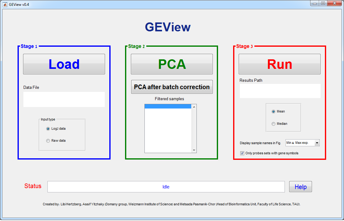
Stage 1 – Load data
Use the “Load” button in order to browse
for the Data File. After choosing the Data File, its path will appear in the
Data File text box.
Stage 2 –
Preprocessing
Click “PCA” in order to
plot the Principal Component Analysis of the samples based on (up to) the 1000
highest variance genes. Using the new figure toolbar, you can rotate (3D) the
PCA figure, zoom in, save, etc.
If you right-click
anywhere on the white space between the points (but not on the points
themselves), a context menu will appear, enabling you to recolor the points
according to any one of the various labels (as defined in the second row in the
input file, see the input section above)

If you right-click on a
point (sample), a context menu will appear, enabling you to remove (filter out)
this point from the analysis.
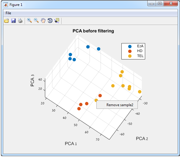
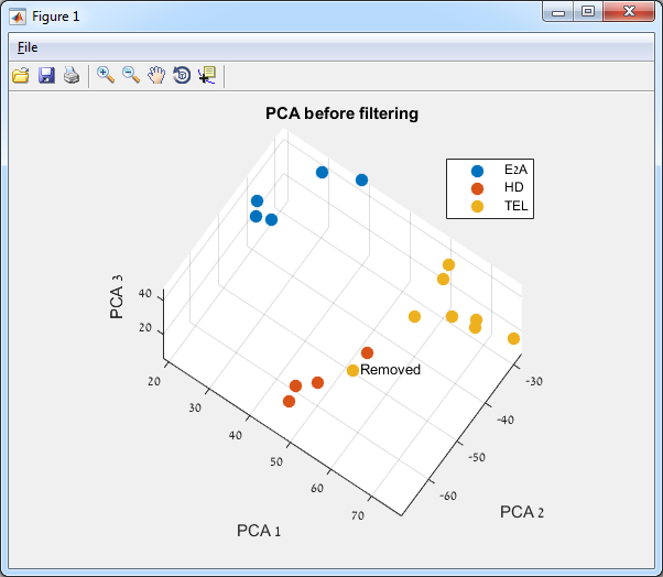
If you click “Remove Sample…” this point
will be designated as “Removed”, and the sample name will appear in the stage 2
“filtered samples” list (see the figures below).
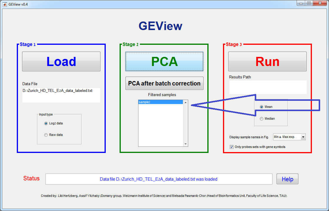
After
removing a sample, you can add it again (cancel the sample removal) by
right-clicking again on the sample and choosing “Add Sample…”.
After
removing the unwanted samples, click “PCA” again in order to recalculate and
redisplay the PCA of the desired samples.
Batch
correction:
Use this button if you
have various batches and you would like to perform batch effect correction. Note:
the batch label must be the second level, after the first underscore (_)
(second line in the input file), see the input section above. Moreover, In order to run the batch
correction, in each batch group, all the various conditions (first label level)
must appear.
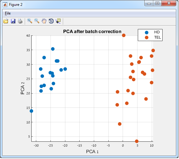
After the batch
correction is completed, an additional PCA figure will open, reflecting the
batch correction output.
The Batch correction
algorithm utilized in GEView is ComBat.
It is implemented in the sva (Surrogate Variable
Analysis) package of Bioconductor.
https://bioconductor.org/packages/release/bioc/html/sva.html
References:
-
Johnson WE, Li
C, Rabinovic A. Adjusting batch effects in microarray
expression data using empirical Bayes methods. Biostatistics. 2007;
8(1):118–27. Epub 2006/04/25. doi: 10.1093/biostatistics/kxj037 PMID: 16632515.
-
Jeffrey T. Leek,
W. Evan Johnson, Hilary S. Parker, Andrew E. Jaffe and John D. Storey (). sva:
Surrogate Variable Analysis, R package version 3.6.0.
Batch correction
Example:
Before:
in the following figure, the samples are grouped according to batches

After: in
the following figure, the samples are grouped according to the experiment
conditions
Stage 3 –
Run
Running the statistical
analysis may take a while depending on the number of the processed probe sets.
You can follow the running progress by watching at the status line at the
bottom of the graphical interface.
This stage generates an
Excel file which summarizes in each line a specific probe. The probe sets are
sorted (starting from the most significant) by the FDR ANOVA Q-value (corrected
p-value, see reference below). Each row contains a link for the figure
containing the ANOVA box plots. Note: in case that there are more than two
experiment conditions (more than two groups in the first level of the labels),
then Tukey’s test for multiple comparison is performed; for each subgroup pair
– the fold change (f.change) and the p-values (“p-val”) are given.
Example for output
table:
|
Probe set ID |
Gene Symbol |
GeneCards Link |
UCSC Link |
NCBI Link |
ANOVA P-value |
Q-value (corrected) |
Box plots |
E2A/HD f.change |
p-val |
E2A/TEL f.change |
p-val |
HD/TEL f.change |
p-val |
|
212148_at |
PBX1 |
2.30E-15 |
3.80E-11 |
20.3 |
1.90E-09 |
21 |
1.90E-09 |
1.03 |
0.9 |
||||
|
212151_at |
PBX1 |
3.50E-13 |
2.90E-09 |
25.2 |
1.90E-09 |
20.6 |
1.90E-09 |
0.817 |
0.2 |
||||
|
200953_s_at |
CCND2 |
2.10E-07 |
0.00022 |
0.0787 |
1.70E-07 |
0.223 |
1.40E-05 |
2.83 |
0.00089 |
||||
|
201005_at |
CD9 |
1.30E-06 |
0.00055 |
0.874 |
0.92 |
10.7 |
6.00E-06 |
12.3 |
6.90E-06 |
||||
|
205253_at |
PBX1 |
3.70E-06 |
0.0011 |
10.8 |
2.60E-05 |
10.8 |
6.10E-06 |
1 |
1 |
||||
|
204849_at |
TCFL5 |
2.20E-05 |
0.0029 |
0.639 |
0.34 |
0.152 |
2.70E-05 |
0.238 |
0.00069 |
||||
|
200951_s_at |
CCND2 |
3.80E-05 |
0.004 |
0.372 |
3.10E-05 |
0.744 |
0.083 |
2 |
0.00049 |
||||
|
221773_at |
ELK3 |
0.0011 |
0.024 |
0.195 |
0.0016 |
0.279 |
0.0039 |
1.43 |
0.56 |
||||
|
200952_s_at |
CCND2 |
0.13 |
0.27 |
0.789 |
0.18 |
0.812 |
0.18 |
1.03 |
0.97 |
||||
|
206127_at |
ELK3 |
0.28 |
0.43 |
0.988 |
0.99 |
0.905 |
0.32 |
0.916 |
0.45 |
FDR reference:
Benjamini, Y., and Hochberg, Y. (1995). Controlling the false discovery rate: A practical and powerful
approach to multiple testing. Journal of the Royal Statistical Society
57, 289–300.
In case that a particular
gene symbol has multiple probe sets, then all probe sets for the same gene are
combined together in the same figure (see an example below). The figure
displays 2 examples: A) 3 probe sets of PBX1. B) 3 probe sets of ELK3. The
Y-axis represents the Log2 expression value and the X-axis represents the 3
experimental conditions (see E2A, HD and TEL X-labels). The number of samples
in each experimental condition is written in parentheses. Each sample
expression value is marked by a red dot and the mean (default) and standard
deviation in each experimental condition are marked by a black line and a blue
box, respectively.
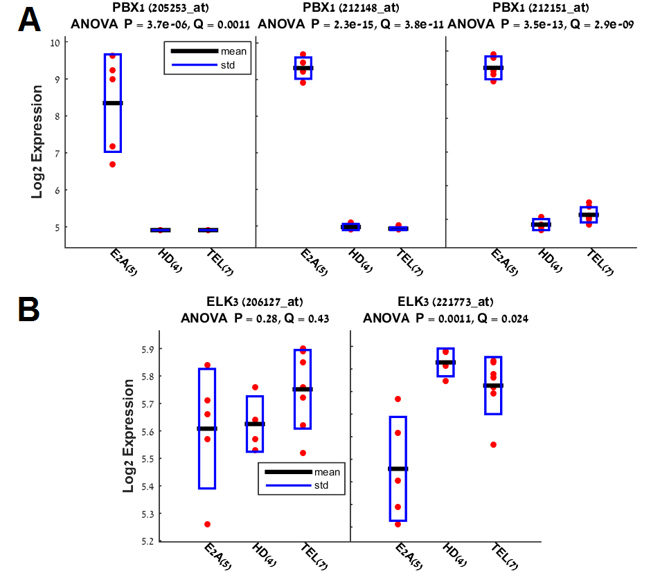
Run parameters
1. You have
the option to display in the figure either the mean (default) or
the median value of each group of conditions. In the example
below, the mean is shown as black line.
2. The
parameter “Display sample names in Fig.” determines which sample names will be
displayed in the figure. The default value (min & max exp.) displays the
names of only 2 samples in each box: the samples with the minimal and maximal
expression. You can also choose to display all the samples (note that this may
be overcrowded), or none of them. In the example above, no sample names are
shown.
3. The
checkbox “only probe sets with gene symbols” (default is checked) determines
whether all probe sets will be analyzed or only probes sets which have gene
symbols (default).